

Friday, 22 February 2013
Potential Film Poster
Here is a potential film poster for our film LUCK OUT that I have created on PhotoShop. I have never used photoshop before so this poster is a simple one, this poster does not contain pictures of our actresses there for we will probably choose a different one with images of the people in our film which is more inviting than this simple poster.

Potential film poster 2
This is my attempt at a potential poster for our short film. I tried to incorporate elements into the poster from the research I had conducted on real posters used for films. For instance, I downloaded the font Steel Tongs in order to ensure that our poster looked professional with the correct font used for the billing block. By using this font our film poster looks identical to typical film posters. I also decided to put the main actors/actresses on the top of the poster, as this is something that a potential audience would take into consideration when choosing a film to watch. I believe a black background best complimented the shot of our characters as they stand out much more clearer. This allows the poster to suggest that our characters are the most important element of our film, and how luck must somehow affect their relationship. I also decided to provide a rating given for our film. If I had to improve this, I would have put underneath who reviewed it and possibly what else they said, to create believability. To improve the font used I would have downloaded some more detailed/creative font in order to make the title stand out from the remainder of the poster so it would capture the audience's attention straight away.

Poster Designs
Design 1
 This is my first design using the 'In her shoes' poster as inspiration. I have put the two girls at the front of the poster to show they are the main characters of the film. By positioning one behind the other shows their is rivalry that the front girl may not know about. Even though the coin is one of the main objects in the film I didn't want it to over power the girls friendship and so I have it on the poster but less obvious.
 The background on the poster is of a location we have used in our film, I have lowered the opacity so that it doesn't take the attention away from the main characters and text, but is still able to be seen.
The name of the film is in the center so that it sands out well and is able to be seen, as well as the strap line. I have also added the names of the actors who appear in the film (as most film do) at the top of the poster in the font ..... that is used on most film posters.
The colours I have used are bright for the background, coin coloured for the text and darker more shadowed with what the characters are wearing. to show mystery and the impression of not knowing everything.
Design 2
 This design for the poster i have used 'warrior' as inspiration. I have used a simple font for the words on the poster so then it is easy for most people to read. The words are gold to represent the coin, I like this as it connects nicely with the story line but I do think the brightness needs increasing to help it stand out a bit more. I have used the actors name at the top so then if anyone recognizes them they are more likely to go and watch the film (especially if they are well known).
I have used dark to colours to represent the mysteriousness of the film and that it isn't all as it seems. However I think this doesn't work as well as i would like as it makes the film look like a thriller or horror more than a drama.
I have positioned the two characters towards each other to show that there is going to be conflict between the two. The coin between them is the main part of the story and by having it between the two characters shows this is what stands between them both.
I think this poster is good as it gives a good idea about the film and what is going to happen with out giving away the full story line. However if we were to use this design i think i need to change the darkness of it as it doesn't look like it is going to be a drama.
Thursday, 21 February 2013
What should a poster consist of?
Not all film posters are identical to one another, as the film needs to have a unique appeal. However, there are elements that every film poster should consist of.
Title:
The title is an extremely important part of the film poster as it should be the element that is catching the audience's attention and making them want to watch the film. Lots of different film titles are effective:

For instance, the JML film title is extremely simplistic. However, it is central on the poster and in a large font which makes it stand out. These are factors that catch the attention of the audience and encourage them to potentially watch the film.
 Another simple film title on a poster is Love Actually's. The font used isn't too fancy. Instead they have used red font to portray the importance of love. This is a good title as it clearly informs the audience what the film will be about. However, the only problem with this film title is that it is displayed fairly small at the bottom of the poster, which may prevent a potential cinema goer/movie buyer from seeing the poster and watching the film.
 However, effective film titles can also be decorative. For instance, the P.S. I Love You film title appears to be written. This is another effective title as it implies that the film will possibly involve someone writing to their loved one. It also emphasises the importance of love in the film. This film title is unique and creative, and most certainly catches the audience 's attention, as it is large and unavoidable.
Strapline:
The strapline is another important element as it provides the audience with a little bit of information about the film before viewing it. A good strapline shouldn't reveal too much of the film's narrative, but just enough to encourage the audience to watch the film. Here is a good example:
Twilight Breaking Dawn Part II has a particularly good strapline as it plays on the fact that it is the finale, which is more likely to entice an audience into watching it in order to see how everything will conclude. The strapline is simple, it does not give away too much to the audience about how the film will conclude or what will take place. This is more effective as an audience is more inclined to watch it as they want to know more.

Who's in it:
An audience might be more likely to watch a film if it includes certain actors/actresses. Because of this, it is important to stress who is in the film on the poster. This should be big enough for an audience to see, but not too big that it distracts the audience's attention away from the film title and strapline.


Date it is released:
This is undoubtedly important as it highlight to the audience when they can actually view the film. Otherwise the poster would be pointless as it wouldn't have achieved anything, as no-one would watch the film.
Examples:


Images:
Images are crucial as they depict what a film is about. The most effective image to use would be a shot of the main character(s) as this would alert the audience of their importance in the film, thus providing them with knowledge before the film begins. Other images are also effective such as a shot of an object or location. These are effective when the film focuses on the importance of these elements, as it alerts the audience to the content of the film.
A good example is P.S. I Love You. It clearly emphasises that the narrative will revolve around the characters on the poster and their relationship. It allows the audience to decide whether they would want to see the film that would include these two characters and may encourage them to watch it to find out the link between the two. This is achievable as they are the only two characters on the poster, so straight away we are aware of their importance.

Mr and Mrs Smith is a good example of how using a shot of the characters can be effective on a film poster. This is a good use of image as it depicts to the audience who the main characters are and that they will be important. It is ambiguous as it doesn't depict the relationship between the two only that the narrative will involve them. The shot of the characters is also effective as it highlights to the audience their profession, as they both have guns on them, this suggests to the audience that there may be a link between them in this matter, possibly that they are in a conflict.

One example that doesn't use characters on their poster is Cloverfield. This is more effective for the film as the film focuses on the events more than the characters. Sometimes it can be more effective for a film poster to only display events that occur in the film as it provides a potential audience with some information about what the film will likely entail.

Billing block:
The Billing block is an important part of any film poster, it usually includes the main cast involved in the film, and the main crew members such as:
Writer, Producer, Editor, Director, Screenplay writer, and Costume Designer
The billing block is written in Steel Tongs in order to provide enough room for all names to be included as the condensed text allows the heights of the characters to meet contractual constraints while still allowing enough horizontal space to include all the required text.
Some examples of billing blocks on film posters:


Title:
The title is an extremely important part of the film poster as it should be the element that is catching the audience's attention and making them want to watch the film. Lots of different film titles are effective:

For instance, the JML film title is extremely simplistic. However, it is central on the poster and in a large font which makes it stand out. These are factors that catch the attention of the audience and encourage them to potentially watch the film.
 Another simple film title on a poster is Love Actually's. The font used isn't too fancy. Instead they have used red font to portray the importance of love. This is a good title as it clearly informs the audience what the film will be about. However, the only problem with this film title is that it is displayed fairly small at the bottom of the poster, which may prevent a potential cinema goer/movie buyer from seeing the poster and watching the film.
 However, effective film titles can also be decorative. For instance, the P.S. I Love You film title appears to be written. This is another effective title as it implies that the film will possibly involve someone writing to their loved one. It also emphasises the importance of love in the film. This film title is unique and creative, and most certainly catches the audience 's attention, as it is large and unavoidable.
Strapline:
The strapline is another important element as it provides the audience with a little bit of information about the film before viewing it. A good strapline shouldn't reveal too much of the film's narrative, but just enough to encourage the audience to watch the film. Here is a good example:
Twilight Breaking Dawn Part II has a particularly good strapline as it plays on the fact that it is the finale, which is more likely to entice an audience into watching it in order to see how everything will conclude. The strapline is simple, it does not give away too much to the audience about how the film will conclude or what will take place. This is more effective as an audience is more inclined to watch it as they want to know more.
Who's in it:
An audience might be more likely to watch a film if it includes certain actors/actresses. Because of this, it is important to stress who is in the film on the poster. This should be big enough for an audience to see, but not too big that it distracts the audience's attention away from the film title and strapline.


Date it is released:
This is undoubtedly important as it highlight to the audience when they can actually view the film. Otherwise the poster would be pointless as it wouldn't have achieved anything, as no-one would watch the film.
Examples:

Images:
Images are crucial as they depict what a film is about. The most effective image to use would be a shot of the main character(s) as this would alert the audience of their importance in the film, thus providing them with knowledge before the film begins. Other images are also effective such as a shot of an object or location. These are effective when the film focuses on the importance of these elements, as it alerts the audience to the content of the film.
A good example is P.S. I Love You. It clearly emphasises that the narrative will revolve around the characters on the poster and their relationship. It allows the audience to decide whether they would want to see the film that would include these two characters and may encourage them to watch it to find out the link between the two. This is achievable as they are the only two characters on the poster, so straight away we are aware of their importance.

Mr and Mrs Smith is a good example of how using a shot of the characters can be effective on a film poster. This is a good use of image as it depicts to the audience who the main characters are and that they will be important. It is ambiguous as it doesn't depict the relationship between the two only that the narrative will involve them. The shot of the characters is also effective as it highlights to the audience their profession, as they both have guns on them, this suggests to the audience that there may be a link between them in this matter, possibly that they are in a conflict.

One example that doesn't use characters on their poster is Cloverfield. This is more effective for the film as the film focuses on the events more than the characters. Sometimes it can be more effective for a film poster to only display events that occur in the film as it provides a potential audience with some information about what the film will likely entail.

Billing block:
The Billing block is an important part of any film poster, it usually includes the main cast involved in the film, and the main crew members such as:
Writer, Producer, Editor, Director, Screenplay writer, and Costume Designer
The billing block is written in Steel Tongs in order to provide enough room for all names to be included as the condensed text allows the heights of the characters to meet contractual constraints while still allowing enough horizontal space to include all the required text.
Some examples of billing blocks on film posters:


Film Poster Analysis
In Her shoes
 This is an existing film poser for 'In Her Shoes.' This film is a comedy- Drama about sister rivalry. This poster represent a drama well because it looks natural and nothing too strange happening. The lighting and colours are bright, and the composition looks slightly staged which helps reflect the comedy aspect of the film.
The clothes the two girls are wearing help represent their personalities and give a small insight to the story line and why they fall out. We see that the woman on the left is smart and uptight as shown in the plain black suit. And the woman on the left is wearing brightly coloured, slightly revealing clothes to show she is more outgoing and a risk taker. The similarities of the two women are the shoes, they are wearing the same shoes but in different colours which reflect the name of the film and that they are sisters. How the girls are sat also shows girls personality.
 The font used is very plain and simple making it easy to read this could also give the impression that the film is easy to watch.
The bright pink colour stands out well in the centre of the poster as it is the thing that catches your eye first. Also because it is pink helps it appeal to a female audience more than a male audience. The word shoes is the only word in capitals meaning this could be the main theme and topic of the film. The tag line is just three words, and because of this it helps people remeber it.
 At the top of the poster it says the actors/ actresses names. Their second name is bolder and bigger than their first because actors are more well known using their second name. Above this it says the director who directed the film and what they have done before, this gives people a vague idea of maybe what to expect and if it should be good or not based on what the director has done before. These words are also in the same font and colour scheme as the rest of the poster.
I like this poster it reflects the film well and gives the audience a good idea about the what to expect. Also the composition is simple which helps it be more eye caching and easier to understand.
 The negatives of this poster are that the writing at the bottom, even though it isn't meant to be clearly readable, is hard to see even trying as the writing is small, pale and crammed together.
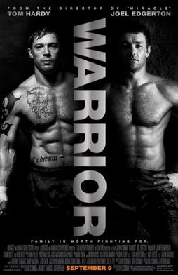
Warrior
 Warrior is a Drama about two brothers who enter a martial arts tournament. This film deals with the brothers struggling relationship with each other and their father.
This poster is very different to the last, it is dark and looks almost mysterious. The colour scheme ranges from black to white to silver, and this could give the impression it is a serious, violent films nothing like the 'in your shoes' which is easy watching and sugar coated. The same colours are used through out the poster except for one word; the release date which is completely different in bright orange to attract more attention. The two men on the poster are half shaded in the dark almost asif they don't want to be fully seen or understood, this could also give the impression that they aren't who they seem to be or that they are hiding something about themself. Because they are both stood in the same position wearing only trousers could suggest that even though they are different people they do have some similarities. This idea could also be how it shows you they are brothers.
The two halfs of the poster could represent the rivalry between them, both their relationship with each other as well as their fighting match against each other. The name of the film through the centre is very powerful as it is big, bold, capitalised, and looks metalic helping it look tough and strong. Also the metalic silver colour it is written in could represent the medals won in the competitions. Because of the strong, masculin impression it gives to the audience, could help the film be aimed more toward men than women.
Like the last poster the name of the main actors and director is stated at the top of the poster, again in the same silver colour as the title to show its importance. Instead of stating the directors name it only says the film they last directed, maybe because he isn't as well known as someone like Steven Speilberg and would like to think the last film he created was good enough for them to be recognised.
 I like this film poster it is very simple and modern and represents the film story well with out giving too much away. However I think the the poster makes the film look more like a thriller or horror than a drama due to the dark lighting and colour scheme
 This is an existing film poser for 'In Her Shoes.' This film is a comedy- Drama about sister rivalry. This poster represent a drama well because it looks natural and nothing too strange happening. The lighting and colours are bright, and the composition looks slightly staged which helps reflect the comedy aspect of the film.
The clothes the two girls are wearing help represent their personalities and give a small insight to the story line and why they fall out. We see that the woman on the left is smart and uptight as shown in the plain black suit. And the woman on the left is wearing brightly coloured, slightly revealing clothes to show she is more outgoing and a risk taker. The similarities of the two women are the shoes, they are wearing the same shoes but in different colours which reflect the name of the film and that they are sisters. How the girls are sat also shows girls personality.
The font used is very plain and simple making it easy to read this could also give the impression that the film is easy to watch. The bright pink colour stands out well in the centre of the poster as it is the thing that catches your eye first. Also because it is pink helps it appeal to a female audience more than a male audience. The word shoes is the only word in capitals meaning this could be the main theme and topic of the film. The tag line is just three words, and because of this it helps people remeber it.
 At the top of the poster it says the actors/ actresses names. Their second name is bolder and bigger than their first because actors are more well known using their second name. Above this it says the director who directed the film and what they have done before, this gives people a vague idea of maybe what to expect and if it should be good or not based on what the director has done before. These words are also in the same font and colour scheme as the rest of the poster.
I like this poster it reflects the film well and gives the audience a good idea about the what to expect. Also the composition is simple which helps it be more eye caching and easier to understand.
 The negatives of this poster are that the writing at the bottom, even though it isn't meant to be clearly readable, is hard to see even trying as the writing is small, pale and crammed together.
Warrior
 Warrior is a Drama about two brothers who enter a martial arts tournament. This film deals with the brothers struggling relationship with each other and their father.
 This poster is very different to the last, it is dark and looks almost mysterious. The colour scheme ranges from black to white to silver, and this could give the impression it is a serious, violent films nothing like the 'in your shoes' which is easy watching and sugar coated. The same colours are used through out the poster except for one word; the release date which is completely different in bright orange to attract more attention. The two men on the poster are half shaded in the dark almost asif they don't want to be fully seen or understood, this could also give the impression that they aren't who they seem to be or that they are hiding something about themself. Because they are both stood in the same position wearing only trousers could suggest that even though they are different people they do have some similarities. This idea could also be how it shows you they are brothers.
The two halfs of the poster could represent the rivalry between them, both their relationship with each other as well as their fighting match against each other. The name of the film through the centre is very powerful as it is big, bold, capitalised, and looks metalic helping it look tough and strong. Also the metalic silver colour it is written in could represent the medals won in the competitions.
 Because of the strong, masculin impression it gives to the audience, could help the film be aimed more toward men than women.
 Like the last poster the name of the main actors and director is stated at the top of the poster, again in the same silver colour as the title to show its importance. Instead of stating the directors name it only says the film they last directed, maybe because he isn't as well known as someone like Steven Speilberg and would like to think the last film he created was good enough for them to be recognised.
Analysis Of A Film Poster

Here is the film poster for Freaky Friday, I chose this poster as it differs from the majority of film posters. This is a Comedy Drama film, and the poster represents the nature of the film. 'Freaky Friday' the poster has two very bright and contrasting background colours, this instantly catches the eye purely because of how much it stands out, it is also representative of the films genre, in the film posters for most drama films there they are usually natural photos and backgrounds used however the comedy element of this film allows for bright colours and clothing which is against the stereo type to be worn.
Usually lettering on posters is block capitals without any effect making it easy to read at first glance however on this poster the title of the film 'Freaky Friday', the films release date and the names of the 2 main characters have an effect on the font which makes the font look as though it is moving however this is cone cleverly as they have put an outline on the shadow of the letters. This is another unique feature of the poster which catches the eye. By all of the letters being in upper case it has no effect on being able to read it like some other font effects may have.

The tag line 'Every teenager's nightmare...turning into her mother' combined with the faces pulled and dressed where by by the actress' give us the impression that the two actresses on the poster are mother and daughter and something 'freaky' is going to happen, this can also be guessed by the fact they look like they are wearing each others clothes.
The fact that this film is made by Walt Disney will automatically make it an appealing film, as it is a well known household name with a good reputation, the company logo is placed just above the title of the film this meaning it will be seen when the title of the film is looked at. Walt Disney will have a fan base which will watch all of the films they produce as they're known for making successful films, if this was a film from the British Film Industry it would likely be less successful at box office as it would know be from a well known company, also there would be less money available to spend on marketing the film. Although this looks like a pretty simple film poster lots of time and money will have been spent on the exact positioning of everything on the poster from mirroring of the 2 colours identically to the positioning of each word.

As in all film posters the font at the bottom is steel tongs, we will also be using this in our film poster to give it a proffesional look.
Analysis of a film poster- Just My Luck
(A quick presentation I made on Prezi with my annotation of the film poster on, which I created before writing my analysis)
http://prezi.com/fraaj6n2nclb/untitled-prezi/

One good example of a similar film poster to our film is the one released for Just My Luck, because film has a similar theme of fantasy and magical elements to ours. The first thing to comment on is the fact that although the main theme is around luck and magic, the poster keeps this knowledge hidden. The way the main characters are placed on the poster does not suggest that either of them own this luck. This keeps the audience guessing why "everything changes in a wink of the eye," and encourages the audience to watch the film to find out how luck links these characters. This would be a good tactic to use for our film poster. We do not want to give away too much information regarding the content of our film, so a simple pose like shown in this poster would be a good idea for a film poster as it would inform the audience about the key characters, but not why they are linked. However, the fact that the film poster is ambiguous, can be interpreted as ineffective. The poster doesn't really tell the audience what the film will be about, why the characters are linked and how the luck will be involved in the plot. Because of this, it could be argued that the film poster is not effective in encouraging the audience to watch the film, instead it may fail to entice them due to the little information provided. I think that although we don't want to give too much away, it would be more effective if we represented luck in our poster. For example, we want to demonstrate that the penny gives the main character luck and that the film will revolve around this. This could be achieved by our main character holding the penny.
 The main character is front and centre of the poster to emphasise her importance. She is the first individual the audience would look at, as she takes up majority of the foreground compared to the male character. The use of pink for her jacket creates the personality of the character; rich and feminine. The use of pink gives the impression that she is surrounded by good events and luck due to the bright colours used. In contrast the male is dressed in dark colours such as black that suggests that he may be associated with bad luck and terrible misfortune. This emphasises that they are polar opposites. He is behind the main girl which gives the idea that although he is important, the luck is not his, it is hers, and because of this he is a lesser character. I believe that it would be effective for our film poster to subliminally give impressions about what we want our audience to think. By having our characters in a similar position, we could suggest that Sarah is the main, lucky character, and Leah is the character who brings her the bad luck.
 The background used is extremely effective as a means of setting up the location of "Just My Luck." The background is of Manhattan, which is the location throughout the duration of the film, which is effective, as it instantly gives the audience information about where the film will be set, to see if it appeals to them. This is a good method as it sets up what the location and the characters would be like, which could possibly entice the audience into viewing the film. I think it would be effective for our film poster to include familiar location that we use in our short film. For example, I believe it would be effective to use the background of Dorothy's house (where the penny is given to Sarah) as a means of creating a familiar background, that the audience would instantly recognise when they viewed the film, as they would have been aware of the importance of this location before even viewing the film. However, on the other hand I also feel that maybe it would not be effective to use a location as our background for our film poster. Because our main storyline is around the luck from the penny, it could be more effective for our film poster to possibly have the penny as the centre, with the main characters sharing the shot. I think, a simple poster with a close shot of Sarah and the penny would be much more effective, to demonstrate its impact and the main character. This would be more effective, as our story is not about where it was shot, but about the impact of the luck penny's luck.
 On the "Just My Luck" poster, "everything changes in a wink of the eye" is used for the strapline. This is an effective strapline because it mentions the theme of the film (the luck) but is fairly ambiguous and vague about what the film consists of. Its primary function of providing an insight to the film is achieved as it very briefly explains that the film will revolve around luck influencing an individual's life. However, it is also effective because it keeps the audience intrigued because it doesn't give too much away about the story, which undoubtedly encourages the audience to go on and watch the film. With regards to our film we also want to achieve something similar with our strapline. We want a short and brief but powerful strapline as a means of enticing the audience. However, we also want to inform the audience about our film before they watch it, in order to make sure we encourage them to watch our film. We could achieve this by having a similar ambiguous strapline to encourage them to watch our film, in a bid to find out why "what goes around, comes back around."
 The font used is extremely appropriate for the poster and the film. It is simplistic in terms of style. This is effective because it doesn't ruin the purpose of the poster by distracting the viewers attention away from using the poster to make a decision about viewing the film. The use of pink is also effective, because it demonstrates the kind of person the main character is, and whether they are interested in watching a character like this. The font is placed at the top centre of the poster which is eye-catching. The audience doesn't have to search for the title as it is clear and central. The remaining text such as the actors/actresses names, strapline and review are in much smaller font, which is also effective as it demonstrates that these are less important and doesn't distract the viewer's attention from the purpose of the poster; which is to stress the name, theme and characters of the film, in a bid to encourage the audience to watch the film. The pink and black coloured font is simplistic and effective, as they are polar opposites. For example black often reflects negativity and misfortune - linking back to the film's theme - whereas pink often reflects positivity and good luck. This is undoubtedly effective as it subliminally informs the audience about the film's theme and is extremely effective as a means of drawing the audience in and encouraging them to watch the film. Additionally, it could also be interpreted as resembling the difference between the boy and girl in the film. For example, she embodies the luck (pink) and he embodies the misfortune (black). I think it would be effective if we took inspiration from the font and font colour used. For our film poster it would look professional if we had the font in a clear and eye-catching place, such as centre or top-centre, with a large bold font, as it wouldn't require the audience to search for the name, and therefore if they were enticed by the name they would browse the rest of the poster and make their decision as to watch it or not. Also, it would be effective to use a simple font type. Our film is fairly simple and straight forward and it would be a nice link to have a font that reflected this.
Wednesday, 20 February 2013
Poster Photo Photoshoot
This is the process we went through during the photo shoot, to take the pictures of the character in our film to put on our film poster designs;
We firstly created a design for our poster so we knew which type of photos we needed to take. This was the first time we had used a DSLR camera therefor it took us a few shots to learn how to focus the camera and get some good pictures.
We chose a few different poses which we could edit into our film poster, and also some different ones so that we had a choice of photographs if we decided that we didn't want to stick to our original idea.
We chose to have our main character Sarah to be closer to the camera and Leah her friend in the back ground, often peering over her shoulder, this was as we wanted to portray the idea that Sarah has the most important role, however both of the girls eyes are focused on the penny, this shows that the penny is significant in the film, this is reinstated by the film name 'Luck Out'
Audience Feedback results (on First draft)
These are the current results of the audience feedback questionnaire. Lots of different people have taken the questionnaire and so we have a wide range of opinions and feedback to help improve our film further.
Results of Sections 1
In this section we asked for a little bit about the person taking the questionnaire so that we could see who is telling us their opinion of the film and whether they were who we were aiming it at and whether their age/ gender would affect their opinion. We have also asked if they think the film is understandable and what genre they think it could be? Also in section one we have asked if they like the style and to state anything they thought was good as well as bad. Also by asking who they think it appeals to this gives us more of an idea of who would enjoy this short film. We have included open questions for the people to give their feedback, this way it is not restricted and they can say what they think. It also helps because we can see any improvement the audience think will benefit the film and we can then try and put it into our film if possible.

Results of section 2
In section 2 we have asked questions about what has been seen in the film. We have asked this to see if certain aspects of the film are picked up on and understood. We have also added a misleading question 'What is the dogs name?' to see if people were watching properly as this isn't stated in the film.

________________________________________________________________
_
Analysis of results
We have have a wide range of people who have taken this questionnaire, both male and female and ages ranging from 10 to above 31. This has helped get a wider view of what different people think rather than just getting the same type and age of people for example teenage girls.

 This graph shows that out of the everyone who answered the questionnaire females enjoyed the film more and overall gave a higher rating out of 10 than the males did. However this doesn't mean to say every female who answered enjoyed the film. But on average this shows that it appeals more to women than men.To get a more accurate idea of who it appeals to, here is a graph showing who the respondents thought it would appeal to.
The graph shows that some people thought the film appealed more to teen than adult and children but there is a small percentage that thought it would appeal to all age groups.
Overall these two graphs show on average female teenager are more likely to enjoy the film more than any other people.
We asked for people to state what they liked and dislike about the film and we have had mixed results. They have mentioned that they think the film has been made to a high quality by having good angles and camera as well as including music that is relevant for what is happening on the film at that certain point. They have also mentioned that the title sequence is good and looks professional.
However the majority of people have mentioned the story line to be too confusing due to jump in time at the start of the film. Originally we wanted the flashback to be the point of realization for both the character and the audience and this would show they are the same character at different ages, but this questionnaire has shown we need to make it more clear to the audience. To sort this problem we need to show that time has moved on and the 2 girls are the same character. We could do this by adding some text on screen to show some years have passed or for the character to say something that shows she is the younger girl a few years on. By doing this this would help explain the character a bit more helping another point the audience dislike about the film.
An improvement that only one person has mentioned but I feel is a big thing we need to do is to alter the volume of some of the sound. They have mentioned that the music is too loud in some parts and that the voice over is too quiet in others. This is a simple alteration that will help improve the quality of the film as well as the audience's understanding because the voice over is a very important turning point in the film.
Another improvement someone said was 'to expand on the thief's role and show more of the characters traits, possibly a reason behind why she took the things and maybe turn the story on it's head and give a plausible explanation why she stole the items e.g. she didn't steal but had them for a good reason that pleased her friend' I really like this idea and if we were to make the film longer and more detailed we could take this into account, but as we are only making a 5 minute film I think this would cause the story line to be too complex.
Section 2 has helped greatly; in seeing if the audience has or hasn't picked up on certain parts of the film that are both important and minor. every question asked everyone got it correct. The main part of the film we wanted the audience to pick up on was the phone getting fixed, but the way the question was asked only a few people put this in their answer, but this is enough to show that they do pick up on it. Even the misleading question about the dogs name went well because no made up a name or thought they had heard one.
Overall the feedback we have gotten from this questionnaire has been very helpful and we are going to use this to improve our film further to make more clear and appealing to our target audience.
Tuesday, 19 February 2013
Audience Feedback on 1st draft of film
Here is the first draft of our film :
We asked for some feed back on the film on the social networking site FaceBook, we posted the link to our film and asked people for some feed back, within 15 minutes of the post being on we got '3 likes' on Annabelle's post and are still awaiting feed back from Becky's post, we are pleased that within such a short time already 3 people 'liked' our film.


We asked for some feed back on the film on the social networking site FaceBook, we posted the link to our film and asked people for some feed back, within 15 minutes of the post being on we got '3 likes' on Annabelle's post and are still awaiting feed back from Becky's post, we are pleased that within such a short time already 3 people 'liked' our film.


We have also posted it on Twitter and are still awaiting some feed back.

Friday, 8 February 2013
Day 4- Shooting pack (Re shooting)
We have added a day of filming because when we added the clips onto the computer few shots needed to be redone to make it them better quality and the storyline more clear. This is our shooting pack for our day of reshooting a few shots.
Treatment
Title of film; Luck Out
Duration; 5min
Certificate; PG
Audience; Our traget audience is women and teenage girls because they can relate to both our main characters.
Script;

Shooting Script;
Long shot of Sarah walking down the street and down Leah's path
Medium to Long shot of Leah walking down side of house
Medium shot of Sarah walking up to the door
Close up of Sarah knocking on the door
Medium long shot of Sarah walking into the house
Long shot of Sarah speaking to Lucy (Leah's sister)
Medium close up of Leah panicking and scrambling to get her things together
Medium shot of Sarah walking up the stairs
Extreme close up of the coin been turned in her hand
Medium Long shot of Sarah going straight into Leah's bedroom
Shot reverse shot as Sarah talks to Leah who is hiding the stolen things
Close up of the things Leah has stolen when Sarah finds them
Medium shot if Sarah furiously getting up
Extreme close up of the double headed penny been slammed down on the table tails up.
Storyboard;

Risk Assessment


Character Profiles
Sarah Brown Aged 16
(played by Annabelle Durham)
Character; Spends all her free time with her family and friends, she loves going shopping, to the cinema and out for her tea.
DOB; 27th April 1996
Hometown; Barnsley
Interests; Shopping, helping her family, baking
Lucy Jones
(Played by Jessica Venson)
Lucy is Leahs sister, she loves, shopping, parties and going out. Lucy is at university doing a fashion degree and only comes home at weekends.
DOB; 21st December 1993
Hometown; Barnsley
Leah Jones
(Played by Rebecca Nightingale)
Leah is Sarahs best friend and is like her sister, she is a quiet person but likes spending time with her friends more than her family.
DOB: 1st May 1996
Hometown: Barnsley
Treatment
Title of film; Luck Out
Duration; 5min
Certificate; PG
Audience; Our traget audience is women and teenage girls because they can relate to both our main characters.
Script;
Shooting Script;
Long shot of Sarah walking down the street and down Leah's path
Medium to Long shot of Leah walking down side of house
Medium shot of Sarah walking up to the door
Close up of Sarah knocking on the door
Medium long shot of Sarah walking into the house
Long shot of Sarah speaking to Lucy (Leah's sister)
Medium close up of Leah panicking and scrambling to get her things together
Medium shot of Sarah walking up the stairs
Extreme close up of the coin been turned in her hand
Medium Long shot of Sarah going straight into Leah's bedroom
Shot reverse shot as Sarah talks to Leah who is hiding the stolen things
Close up of the things Leah has stolen when Sarah finds them
Medium shot if Sarah furiously getting up
Extreme close up of the double headed penny been slammed down on the table tails up.
Storyboard;
Risk Assessment


Character Profiles
Sarah Brown Aged 16
(played by Annabelle Durham)
Character; Spends all her free time with her family and friends, she loves going shopping, to the cinema and out for her tea.
DOB; 27th April 1996
Hometown; Barnsley
Interests; Shopping, helping her family, baking
Lucy Jones
(Played by Jessica Venson)
Lucy is Leahs sister, she loves, shopping, parties and going out. Lucy is at university doing a fashion degree and only comes home at weekends.
DOB; 21st December 1993
Hometown; Barnsley
Leah Jones
(Played by Rebecca Nightingale)
Leah is Sarahs best friend and is like her sister, she is a quiet person but likes spending time with her friends more than her family.
DOB: 1st May 1996
Hometown: Barnsley
Wednesday, 6 February 2013
Extra Flashback research
Vanilla Sky is a film about a publisher who falls in love but his lover doesn't agree which causes things to take a turn for the surreal when she drives herself and him off a bridge.
This film include several flashback in different styles, from slow motion to pictures from the past and I think these type and style would be appropriate for our film for the flashback at the end, when Sarah realizes that it is the penny that is lucky, and previous shots from the film are show to prove it is the coins and when it happens.
This flashback has the main character speaking over the picture explaining how he feels, and every so often flashes back to when he was a little boy to where he is dreaming and to when he if falling off the building. All this is in slow motion to create tension and atmosphere. (the flashback starts at 1:23)
The very last flashback included a mixture of pictures film, home videos all at different speeds. This is the most effective and i think we could use a similar flashback in our film.


Subscribe to:
Posts (Atom)