
Showing posts with label Jessica Venson. Show all posts
Showing posts with label Jessica Venson. Show all posts
Monday, 15 April 2013
Our Radio Trailers
We decided due to the nature of our film we would create two radio spots, this is as after creating one using a male voice we realised as our film is a family / film for teenage girls a female voice may come across better, here is the first radio trailer we have done and want to work on another one which we feel will appeal to our target audience better. We also feel this spot would appear on a mainstream radio station where as the one we plan to create is one you would expect to hear on a local radio station as due to our film being a small British one the people who are likely to watch it are more likely to listen to local family radio stations.

Friday, 12 April 2013
Critical Evaluation- Question 1
1. In what ways does the media product use, develop or
challenge forms and conventions of real media products?

 We also followed conventions such as time passing. We needed
to show time has passed a number of times through out the film, subtly but
still able to be picked up on. For the first passage of time we used text on
screen to show that 5 years had passed since the last scene. If we didn't this
would have been confusing as it wasn't the same actor playing the character as
before because time had moved on and she is now older. Another technique we
used was dissolves, both through black and straight into the next shot.
We also followed conventions such as time passing. We needed
to show time has passed a number of times through out the film, subtly but
still able to be picked up on. For the first passage of time we used text on
screen to show that 5 years had passed since the last scene. If we didn't this
would have been confusing as it wasn't the same actor playing the character as
before because time had moved on and she is now older. Another technique we
used was dissolves, both through black and straight into the next shot.
 Even though our film is linear and shows the action in the
same order it happens we have used a flashback
Even though our film is linear and shows the action in the
same order it happens we have used a flashback
to show realization that the penny is lucky. This has allowed us to experiment with different transitions and filters to show it is a flashback of certain previous event but keep it continuous even though there is no match on action or similar shots.

Our film was originally a Drama as it met all the requirements, realistic characters, emotions and real life problems. But after we revisited our plot we realized it was more of a hybrid genre of both Drama and Fantasy because it included supernatural, magic components as the main plot.

 Another film we used as inspirations was
‘Vanilla Sky’ we analysed the flashbacks in this film because they were
obviously a flashback with lots of fast clips and photos, this is how we wanted
our flashback to look.
Another film we used as inspirations was
‘Vanilla Sky’ we analysed the flashbacks in this film because they were
obviously a flashback with lots of fast clips and photos, this is how we wanted
our flashback to look.
 ‘Just my luck’ had the biggest impact on our
film, as it is very similar to our story line and narrative. For example the
main theme is luck, both film have both luck and unlucky in them.
‘Just my luck’ had the biggest impact on our
film, as it is very similar to our story line and narrative. For example the
main theme is luck, both film have both luck and unlucky in them.
We made sure that our film followed any conventions and
continuity during both the editing and shooting of the film as much as possible
to create a continuous film for the audience to understand and find it easy to
watch.
The 180-degree rule is one the most important rules we
followed, because if not it can be confusing for the audience to follow, e.g.
where the characters are in the room may appear to have changed if the line is
crossed. Even though we followed this rules it can be broken to give a confused
effect this could be used in a psychological genre.


We have also tried to use a variety of shot to direct
the audience’s attention and to show extra detail that is needed for the story line to make sense. For example a close up on the coin to show it is
double headed and an establishing shot of the park to show where Sarah is and
that it is snowy and icy.
 Because we have used lots of different types of
shots, to make these flow continuously together we also needed to use match on
action. This is where a shot angle changes but the action still continues.
Because we have used lots of different types of
shots, to make these flow continuously together we also needed to use match on
action. This is where a shot angle changes but the action still continues.


 We also followed conventions such as time passing. We needed
to show time has passed a number of times through out the film, subtly but
still able to be picked up on. For the first passage of time we used text on
screen to show that 5 years had passed since the last scene. If we didn't this
would have been confusing as it wasn't the same actor playing the character as
before because time had moved on and she is now older. Another technique we
used was dissolves, both through black and straight into the next shot.
We also followed conventions such as time passing. We needed
to show time has passed a number of times through out the film, subtly but
still able to be picked up on. For the first passage of time we used text on
screen to show that 5 years had passed since the last scene. If we didn't this
would have been confusing as it wasn't the same actor playing the character as
before because time had moved on and she is now older. Another technique we
used was dissolves, both through black and straight into the next shot. Even though our film is linear and shows the action in the
same order it happens we have used a flashback
Even though our film is linear and shows the action in the
same order it happens we have used a flashbackto show realization that the penny is lucky. This has allowed us to experiment with different transitions and filters to show it is a flashback of certain previous event but keep it continuous even though there is no match on action or similar shots.

Our film was originally a Drama as it met all the requirements, realistic characters, emotions and real life problems. But after we revisited our plot we realized it was more of a hybrid genre of both Drama and Fantasy because it included supernatural, magic components as the main plot.
Our film reflects a fantasy drama well, as it includes all
the main conventions and paradigms needed to be in this genre category.
It reflects a drama as it includes realistic characters,
emotions and real life problems such as; Sarah is a typical teenage girls whose
mum tries interfering with her life by telling her what to do all the time, she
slips on some ice while walking the dog and to make her day worse her mum
accuses her of stealing even though she is innocent.
It reflects conventions of been a fantasy. To be a fantasy
it needs to include supernatural or magical elements as the main plot or
location. In our film our main characters grandma gives her a double-headed
coin but this coin is magical and bring luck to its owner, through out the film
the coin causes the bad thing that happen through out the day to be corrected
such as when the dog lead is dropped the dog doesn't run away and after she
breaks her phone it magically fixes its self. These elements could also be seen
as paradigms of a fantasy about a lucky penny. For example the luck makes bad
things better, our main character is helped and the villain is brought to
justice.
However our film does also challenge this genre type, as it doesn't end happily ever after as most dramas do, we have left the ending quite
open. The end shot is of the double-headed coin landing on tails and Sarah
saying ‘This coin must be bringing me luck because it has stuck by me, unlike
you.’ This doesn't end all wrapped up, we have left it so that it is open to
interpretation and the audience can take what they want from it.
This film does fulfill the nature of a fantasy drama and
would meet expectations, however even though it is a fantasy there is very
little fantasy compared to other fantasy drama films such as the Twilight saga
and Harry Potter because non of the fantasy in these film are real. However in
our film it is a lucky coin and some people do believe lucky objects exist.
Our
audience are people who enjoy dramas and but feel it is more
targeted towards teenage girls.
Overall
we want the audience to come away feeling happy and relaxed as well as thinking
what will happen to the two friends relationship now Sarah knows the truth.
Richard Dyer's theory states that different people will respond differently to a film or media text to replace something that is missing in their own lives, this is called `Utopian Solutions.' For example if the viewer if feeling tired they are likely to enjoy something with energy like an action film. This theory is present in our film as it intense and anyone who is bored would enjoy this as it gives them something to intrigue and entertain them. For example Sarah doesn't know it is the coin until the end flashback but the audience do, also Sarah doesn't realise her phone is broken and then it suddenly gets mended. All these would leave the audience on the edge of their seat wondering when the main character will realise. I am confident we have achieved this because in the film we have teenage girls just like our target audience and so can relate to each other. We have event don't get resolved till the very end and we leave the ending open so that the audience will be wanting to know more and so not be bored any more.
Richard Dyer's theory states that different people will respond differently to a film or media text to replace something that is missing in their own lives, this is called `Utopian Solutions.' For example if the viewer if feeling tired they are likely to enjoy something with energy like an action film. This theory is present in our film as it intense and anyone who is bored would enjoy this as it gives them something to intrigue and entertain them. For example Sarah doesn't know it is the coin until the end flashback but the audience do, also Sarah doesn't realise her phone is broken and then it suddenly gets mended. All these would leave the audience on the edge of their seat wondering when the main character will realise. I am confident we have achieved this because in the film we have teenage girls just like our target audience and so can relate to each other. We have event don't get resolved till the very end and we leave the ending open so that the audience will be wanting to know more and so not be bored any more.
Through out the making of our film we have
recognized several similarities in existing films that we have used to help us
improve our ideas as well as use similar films as inspiration.
For example for our title sequence we had
an idea of lots of coins falling in a waterfall of coins effect. We then found
an existing title sequence off ‘Dear John’ where coins are been made and they
fall onto and off conveyor belts.

We have used this as inspirations and tried getting the same falling effect but dropping coins onto a pile.


We have used this as inspirations and tried getting the same falling effect but dropping coins onto a pile.


 Another film we used as inspirations was
‘Vanilla Sky’ we analysed the flashbacks in this film because they were
obviously a flashback with lots of fast clips and photos, this is how we wanted
our flashback to look.
Another film we used as inspirations was
‘Vanilla Sky’ we analysed the flashbacks in this film because they were
obviously a flashback with lots of fast clips and photos, this is how we wanted
our flashback to look.  ‘Just my luck’ had the biggest impact on our
film, as it is very similar to our story line and narrative. For example the
main theme is luck, both film have both luck and unlucky in them.
‘Just my luck’ had the biggest impact on our
film, as it is very similar to our story line and narrative. For example the
main theme is luck, both film have both luck and unlucky in them.
Wednesday, 10 April 2013
Thursday, 28 March 2013
Tuesday, 26 March 2013
Critical Evaluation- Question 4
4. How
did you use new media technologies in the construction and research, planning
and evaluation stages?
Through out the majority of researching and creation of our film new technologies have been critical pieces of equipment we needed to allow us to do so....
Through out the majority of researching and creation of our film new technologies have been critical pieces of equipment we needed to allow us to do so....
Monday, 4 March 2013

Saturday, 2 March 2013
Radio Trailer Advert Research
The Radio is the first mass communication device and was invented by Gugliemo Maconi in late 1800's. In 1923 radio began broadcasting. Due to the radio reaching the majority of people this has, and is a key method for communication with the public, and so is the perfect way to advertise.
The radio can advertise anything from products, to companies to film and is much cheaper than advertising on the TV. It is also easier to target the appropriate audience.
Film radio trailers are very similar to a picture trailer, but need to include more detail through sound, so that the atmosphere and mental image of the film are as similar as possible to the actual film. To create the same effect as a picture trailer several techniques are used:
- Music
Music sets the scene in a radio trailer often representing the film with its tone, lyrics, familiarity and how appropriate it is, for example an action could have rock music and a romance could have a romantic song etc. In many cases the music is the soundtrack to the film.
It is an important way to get the audiences attention, also to associate the music with the film and the film with the music. During a radio trailer the music will play throughout, but mainly in the background, with the voice over and sound clips from the film over the top. During the end of the trailer the music often gets louder and more dramatic to get the audience interested and wanting to know what happens.
- Voice over
The voice over is the narrator of the trailer and explains key parts of the film such as a brief on the story line, reviews, nominations or awards and the release date. The voice over has to be memorable but also needs to be able to relate to the target audience for example a deep masculine voice for action, or comedy and a less powerful voice for something like a drama or romance.
A well known Voice over is Don LaFontaine, he has a naturally deep voice which gives power, atmosphere and character to film trailers both radio and picture.
- Sound effects
Sound effects are used to give the trailer character. These effects often include paradigms of the films genre e.g. An action film will have explosions, these sound effects will come from what are in the film.
- Clips from the film
Clips of sound from the film are included to give an idea about the film; the story line, style, genre and an idea whether you may like it or not. These clips often include key parts of the films story line and give a taster of what to expect but not giving away the whole film.
Layout of Film Radio Trailers
Radio trailers all have a similar layout in the way they are set out and what is included. The voice over often begins by setting the scene and maybe a review about the film, it would then have sound clips taken from the film between the voice overs comments, there would be some sound effects and the music would be louder and finally the release date would be mentioned.
Example
This is an American Radio trailer for the 2010 film 'The Book of Eli.'
This radio trailer is very generic in the way that it has a deep male voice over, which gives the film suspense drama and action. And gives all the key points of the film with out giving away the whole story line. The trailer starts by mentioning reviews from critics and what they think of the film. By having this first it would attract more people to want to carry on listening to the trailer and find out more about this highly rated film as it is said to be 'An absolute must see, Action packed and inspirational.' The description of the film is very brief and so only gives a small explanation into what happens but because of all the positive feedback and the way it is said for example 'action packet' and 'rare' this gives us extra information about the film with out meaning to and so the small explanation would not matter too much. Denzil Washinton is mentioned to be 'at the top of his game' and so would appeal to people who like to watch this particular actor, or just like to watch actors who have a special mention in film reviews. By having the certificate in the trailer it shows clearly who can go and watch it and gives an idea what type of film it is because younger teens are not permitted to watch it. We also know from the trailer that this film is already out in the cinemas as it states clearly that it is in cinemas everywhere. The music in the background gives the feeling of suspense threat and triumph and so would give the impression this is what to expect while watching the film. Even though the music is quiet it is still loud enough to hear and take effect.
There are however quite a few differences between this trailer and conventional British film radio trailers. This trailer doesn't have any sound clips from the film its self only a background soundtrack that may or may not be from the film. It also doesn't have any sound effects that you would expect with an action film. Another difference is that trailer in Britain don't usually say the certificate of the film.
This is the picture trailer of the same film. This trailer is very similar to the radio on as it doesn't give too much away about the story line but still gives a taster on what the film is about. However a difference is that it uses a character to do the narrating voice over instead of a deep male voice.
Our Radio Trailer
We will use this information in our on trailer by using all the conventions found that needed to be in radio trailer; music, voice over, and clips from film. We will use key quotes that are said in our film to explain in brief our story line, as well as a narrator to explain in further detail, maybe including reviews or nomination etc. Unlike the book of eli radio advert we want to include clips from our film so that the audience can get a flavour of what to expect.
The radio can advertise anything from products, to companies to film and is much cheaper than advertising on the TV. It is also easier to target the appropriate audience.
Film radio trailers are very similar to a picture trailer, but need to include more detail through sound, so that the atmosphere and mental image of the film are as similar as possible to the actual film. To create the same effect as a picture trailer several techniques are used:
- Music
Music sets the scene in a radio trailer often representing the film with its tone, lyrics, familiarity and how appropriate it is, for example an action could have rock music and a romance could have a romantic song etc. In many cases the music is the soundtrack to the film.
It is an important way to get the audiences attention, also to associate the music with the film and the film with the music. During a radio trailer the music will play throughout, but mainly in the background, with the voice over and sound clips from the film over the top. During the end of the trailer the music often gets louder and more dramatic to get the audience interested and wanting to know what happens.
- Voice over
The voice over is the narrator of the trailer and explains key parts of the film such as a brief on the story line, reviews, nominations or awards and the release date. The voice over has to be memorable but also needs to be able to relate to the target audience for example a deep masculine voice for action, or comedy and a less powerful voice for something like a drama or romance.
A well known Voice over is Don LaFontaine, he has a naturally deep voice which gives power, atmosphere and character to film trailers both radio and picture.
- Sound effects
Sound effects are used to give the trailer character. These effects often include paradigms of the films genre e.g. An action film will have explosions, these sound effects will come from what are in the film.
- Clips from the film
Clips of sound from the film are included to give an idea about the film; the story line, style, genre and an idea whether you may like it or not. These clips often include key parts of the films story line and give a taster of what to expect but not giving away the whole film.
Layout of Film Radio Trailers
Radio trailers all have a similar layout in the way they are set out and what is included. The voice over often begins by setting the scene and maybe a review about the film, it would then have sound clips taken from the film between the voice overs comments, there would be some sound effects and the music would be louder and finally the release date would be mentioned.
Example
This is an American Radio trailer for the 2010 film 'The Book of Eli.'
This radio trailer is very generic in the way that it has a deep male voice over, which gives the film suspense drama and action. And gives all the key points of the film with out giving away the whole story line. The trailer starts by mentioning reviews from critics and what they think of the film. By having this first it would attract more people to want to carry on listening to the trailer and find out more about this highly rated film as it is said to be 'An absolute must see, Action packed and inspirational.' The description of the film is very brief and so only gives a small explanation into what happens but because of all the positive feedback and the way it is said for example 'action packet' and 'rare' this gives us extra information about the film with out meaning to and so the small explanation would not matter too much. Denzil Washinton is mentioned to be 'at the top of his game' and so would appeal to people who like to watch this particular actor, or just like to watch actors who have a special mention in film reviews. By having the certificate in the trailer it shows clearly who can go and watch it and gives an idea what type of film it is because younger teens are not permitted to watch it. We also know from the trailer that this film is already out in the cinemas as it states clearly that it is in cinemas everywhere. The music in the background gives the feeling of suspense threat and triumph and so would give the impression this is what to expect while watching the film. Even though the music is quiet it is still loud enough to hear and take effect.
There are however quite a few differences between this trailer and conventional British film radio trailers. This trailer doesn't have any sound clips from the film its self only a background soundtrack that may or may not be from the film. It also doesn't have any sound effects that you would expect with an action film. Another difference is that trailer in Britain don't usually say the certificate of the film.
This is the picture trailer of the same film. This trailer is very similar to the radio on as it doesn't give too much away about the story line but still gives a taster on what the film is about. However a difference is that it uses a character to do the narrating voice over instead of a deep male voice.
Our Radio Trailer
We will use this information in our on trailer by using all the conventions found that needed to be in radio trailer; music, voice over, and clips from film. We will use key quotes that are said in our film to explain in brief our story line, as well as a narrator to explain in further detail, maybe including reviews or nomination etc. Unlike the book of eli radio advert we want to include clips from our film so that the audience can get a flavour of what to expect.
Friday, 1 March 2013
Film Poster Step by Step

I started by uploading the photo onto photoshop and but around the two characters using the laso tool. I then deleted the background ready to add my own.

 I then added another background. I used a photo f a location we actually used in the film. I like this look it is bright and natural just like our film.
However when I added the title of our film we we wanted it to be the same colour as the coin, but to have this it blended too much into the background.

To sort this problem I lowered the opacity of the background so that it was still able to be seen and the wording and characters still stood out.
 I then added the names of the actors, what films we have directed before and extra info e.g. who directed, produced and edited.
This is our final poster design. We have used one of the draft designs as a template. We took our own pictures of our two characters and uploaded the best ones to photoshop, we then chose the clearest more appropriate photo that represented our storyline and the two characters. The rest of the poster was then built around the photos. The photo of a location we used in the film is used as the background and then opacity was lowered so it was still able to be seen but didn't take the attention away from the main parts of the poster. The title of the film is in the centre so it is clearly seen and stands out well for it to be read easily. The O is a slightly different colour to represent the coin, we have tried to get the colour as close to a coin as possible but still make sure it stands out and doesn't blend in. The writing at the top and bottom of the poster is in steel tongs font, that is used on almost all film posters. The colour is similar to the coin colour but because it is on the photos that are quite dark I had to lighten the shade so it was able to be seen better. The top of the poster shows what we have made before and can appeal to audiences who have watched that previous film and enjoyed it. Also by having the actors name at the top this also can appeal the people who like the certain actor/ actress. Their second name is in bold because in most cases actors are more well known for their second name than their first.

Friday, 22 February 2013
Poster Designs
Design 1
 This is my first design using the 'In her shoes' poster as inspiration. I have put the two girls at the front of the poster to show they are the main characters of the film. By positioning one behind the other shows their is rivalry that the front girl may not know about. Even though the coin is one of the main objects in the film I didn't want it to over power the girls friendship and so I have it on the poster but less obvious.
 The background on the poster is of a location we have used in our film, I have lowered the opacity so that it doesn't take the attention away from the main characters and text, but is still able to be seen.
The name of the film is in the center so that it sands out well and is able to be seen, as well as the strap line. I have also added the names of the actors who appear in the film (as most film do) at the top of the poster in the font ..... that is used on most film posters.
The colours I have used are bright for the background, coin coloured for the text and darker more shadowed with what the characters are wearing. to show mystery and the impression of not knowing everything.
Design 2
 This design for the poster i have used 'warrior' as inspiration. I have used a simple font for the words on the poster so then it is easy for most people to read. The words are gold to represent the coin, I like this as it connects nicely with the story line but I do think the brightness needs increasing to help it stand out a bit more. I have used the actors name at the top so then if anyone recognizes them they are more likely to go and watch the film (especially if they are well known).
I have used dark to colours to represent the mysteriousness of the film and that it isn't all as it seems. However I think this doesn't work as well as i would like as it makes the film look like a thriller or horror more than a drama.
I have positioned the two characters towards each other to show that there is going to be conflict between the two. The coin between them is the main part of the story and by having it between the two characters shows this is what stands between them both.
I think this poster is good as it gives a good idea about the film and what is going to happen with out giving away the full story line. However if we were to use this design i think i need to change the darkness of it as it doesn't look like it is going to be a drama.
Thursday, 21 February 2013
Film Poster Analysis
In Her shoes
 This is an existing film poser for 'In Her Shoes.' This film is a comedy- Drama about sister rivalry. This poster represent a drama well because it looks natural and nothing too strange happening. The lighting and colours are bright, and the composition looks slightly staged which helps reflect the comedy aspect of the film.
The clothes the two girls are wearing help represent their personalities and give a small insight to the story line and why they fall out. We see that the woman on the left is smart and uptight as shown in the plain black suit. And the woman on the left is wearing brightly coloured, slightly revealing clothes to show she is more outgoing and a risk taker. The similarities of the two women are the shoes, they are wearing the same shoes but in different colours which reflect the name of the film and that they are sisters. How the girls are sat also shows girls personality.
 The font used is very plain and simple making it easy to read this could also give the impression that the film is easy to watch.
The bright pink colour stands out well in the centre of the poster as it is the thing that catches your eye first. Also because it is pink helps it appeal to a female audience more than a male audience. The word shoes is the only word in capitals meaning this could be the main theme and topic of the film. The tag line is just three words, and because of this it helps people remeber it.
 At the top of the poster it says the actors/ actresses names. Their second name is bolder and bigger than their first because actors are more well known using their second name. Above this it says the director who directed the film and what they have done before, this gives people a vague idea of maybe what to expect and if it should be good or not based on what the director has done before. These words are also in the same font and colour scheme as the rest of the poster.
I like this poster it reflects the film well and gives the audience a good idea about the what to expect. Also the composition is simple which helps it be more eye caching and easier to understand.
 The negatives of this poster are that the writing at the bottom, even though it isn't meant to be clearly readable, is hard to see even trying as the writing is small, pale and crammed together.
Warrior
 Warrior is a Drama about two brothers who enter a martial arts tournament. This film deals with the brothers struggling relationship with each other and their father.
This poster is very different to the last, it is dark and looks almost mysterious. The colour scheme ranges from black to white to silver, and this could give the impression it is a serious, violent films nothing like the 'in your shoes' which is easy watching and sugar coated. The same colours are used through out the poster except for one word; the release date which is completely different in bright orange to attract more attention. The two men on the poster are half shaded in the dark almost asif they don't want to be fully seen or understood, this could also give the impression that they aren't who they seem to be or that they are hiding something about themself. Because they are both stood in the same position wearing only trousers could suggest that even though they are different people they do have some similarities. This idea could also be how it shows you they are brothers.
The two halfs of the poster could represent the rivalry between them, both their relationship with each other as well as their fighting match against each other. The name of the film through the centre is very powerful as it is big, bold, capitalised, and looks metalic helping it look tough and strong. Also the metalic silver colour it is written in could represent the medals won in the competitions. Because of the strong, masculin impression it gives to the audience, could help the film be aimed more toward men than women.
Like the last poster the name of the main actors and director is stated at the top of the poster, again in the same silver colour as the title to show its importance. Instead of stating the directors name it only says the film they last directed, maybe because he isn't as well known as someone like Steven Speilberg and would like to think the last film he created was good enough for them to be recognised.
 I like this film poster it is very simple and modern and represents the film story well with out giving too much away. However I think the the poster makes the film look more like a thriller or horror than a drama due to the dark lighting and colour scheme
 This is an existing film poser for 'In Her Shoes.' This film is a comedy- Drama about sister rivalry. This poster represent a drama well because it looks natural and nothing too strange happening. The lighting and colours are bright, and the composition looks slightly staged which helps reflect the comedy aspect of the film.
The clothes the two girls are wearing help represent their personalities and give a small insight to the story line and why they fall out. We see that the woman on the left is smart and uptight as shown in the plain black suit. And the woman on the left is wearing brightly coloured, slightly revealing clothes to show she is more outgoing and a risk taker. The similarities of the two women are the shoes, they are wearing the same shoes but in different colours which reflect the name of the film and that they are sisters. How the girls are sat also shows girls personality.
The font used is very plain and simple making it easy to read this could also give the impression that the film is easy to watch. The bright pink colour stands out well in the centre of the poster as it is the thing that catches your eye first. Also because it is pink helps it appeal to a female audience more than a male audience. The word shoes is the only word in capitals meaning this could be the main theme and topic of the film. The tag line is just three words, and because of this it helps people remeber it.
 At the top of the poster it says the actors/ actresses names. Their second name is bolder and bigger than their first because actors are more well known using their second name. Above this it says the director who directed the film and what they have done before, this gives people a vague idea of maybe what to expect and if it should be good or not based on what the director has done before. These words are also in the same font and colour scheme as the rest of the poster.
I like this poster it reflects the film well and gives the audience a good idea about the what to expect. Also the composition is simple which helps it be more eye caching and easier to understand.
 The negatives of this poster are that the writing at the bottom, even though it isn't meant to be clearly readable, is hard to see even trying as the writing is small, pale and crammed together.
Warrior
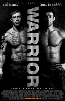 Warrior is a Drama about two brothers who enter a martial arts tournament. This film deals with the brothers struggling relationship with each other and their father.
 This poster is very different to the last, it is dark and looks almost mysterious. The colour scheme ranges from black to white to silver, and this could give the impression it is a serious, violent films nothing like the 'in your shoes' which is easy watching and sugar coated. The same colours are used through out the poster except for one word; the release date which is completely different in bright orange to attract more attention. The two men on the poster are half shaded in the dark almost asif they don't want to be fully seen or understood, this could also give the impression that they aren't who they seem to be or that they are hiding something about themself. Because they are both stood in the same position wearing only trousers could suggest that even though they are different people they do have some similarities. This idea could also be how it shows you they are brothers.
The two halfs of the poster could represent the rivalry between them, both their relationship with each other as well as their fighting match against each other. The name of the film through the centre is very powerful as it is big, bold, capitalised, and looks metalic helping it look tough and strong. Also the metalic silver colour it is written in could represent the medals won in the competitions.
 Because of the strong, masculin impression it gives to the audience, could help the film be aimed more toward men than women.
 Like the last poster the name of the main actors and director is stated at the top of the poster, again in the same silver colour as the title to show its importance. Instead of stating the directors name it only says the film they last directed, maybe because he isn't as well known as someone like Steven Speilberg and would like to think the last film he created was good enough for them to be recognised.
 I like this film poster it is very simple and modern and represents the film story well with out giving too much away. However I think the the poster makes the film look more like a thriller or horror than a drama due to the dark lighting and colour scheme
Wednesday, 20 February 2013
Poster Photo Photoshoot
This is the process we went through during the photo shoot, to take the pictures of the character in our film to put on our film poster designs;
We firstly created a design for our poster so we knew which type of photos we needed to take. This was the first time we had used a DSLR camera therefor it took us a few shots to learn how to focus the camera and get some good pictures.
We chose a few different poses which we could edit into our film poster, and also some different ones so that we had a choice of photographs if we decided that we didn't want to stick to our original idea.
We chose to have our main character Sarah to be closer to the camera and Leah her friend in the back ground, often peering over her shoulder, this was as we wanted to portray the idea that Sarah has the most important role, however both of the girls eyes are focused on the penny, this shows that the penny is significant in the film, this is reinstated by the film name 'Luck Out'
We firstly created a design for our poster so we knew which type of photos we needed to take. This was the first time we had used a DSLR camera therefor it took us a few shots to learn how to focus the camera and get some good pictures.
We chose a few different poses which we could edit into our film poster, and also some different ones so that we had a choice of photographs if we decided that we didn't want to stick to our original idea.
We chose to have our main character Sarah to be closer to the camera and Leah her friend in the back ground, often peering over her shoulder, this was as we wanted to portray the idea that Sarah has the most important role, however both of the girls eyes are focused on the penny, this shows that the penny is significant in the film, this is reinstated by the film name 'Luck Out'
Audience Feedback results (on First draft)
These are the current results of the audience feedback questionnaire. Lots of different people have taken the questionnaire and so we have a wide range of opinions and feedback to help improve our film further.
Results of Sections 1
In this section we asked for a little bit about the person taking the questionnaire so that we could see who is telling us their opinion of the film and whether they were who we were aiming it at and whether their age/ gender would affect their opinion. We have also asked if they think the film is understandable and what genre they think it could be? Also in section one we have asked if they like the style and to state anything they thought was good as well as bad. Also by asking who they think it appeals to this gives us more of an idea of who would enjoy this short film. We have included open questions for the people to give their feedback, this way it is not restricted and they can say what they think. It also helps because we can see any improvement the audience think will benefit the film and we can then try and put it into our film if possible.

Results of section 2
In section 2 we have asked questions about what has been seen in the film. We have asked this to see if certain aspects of the film are picked up on and understood. We have also added a misleading question 'What is the dogs name?' to see if people were watching properly as this isn't stated in the film.


Results of section 2
In section 2 we have asked questions about what has been seen in the film. We have asked this to see if certain aspects of the film are picked up on and understood. We have also added a misleading question 'What is the dogs name?' to see if people were watching properly as this isn't stated in the film.

________________________________________________________________
_
Analysis of results
We have have a wide range of people who have taken this questionnaire, both male and female and ages ranging from 10 to above 31. This has helped get a wider view of what different people think rather than just getting the same type and age of people for example teenage girls.

 This graph shows that out of the everyone who answered the questionnaire females enjoyed the film more and overall gave a higher rating out of 10 than the males did. However this doesn't mean to say every female who answered enjoyed the film. But on average this shows that it appeals more to women than men.To get a more accurate idea of who it appeals to, here is a graph showing who the respondents thought it would appeal to.
The graph shows that some people thought the film appealed more to teen than adult and children but there is a small percentage that thought it would appeal to all age groups.
Overall these two graphs show on average female teenager are more likely to enjoy the film more than any other people.
We asked for people to state what they liked and dislike about the film and we have had mixed results. They have mentioned that they think the film has been made to a high quality by having good angles and camera as well as including music that is relevant for what is happening on the film at that certain point. They have also mentioned that the title sequence is good and looks professional.
However the majority of people have mentioned the story line to be too confusing due to jump in time at the start of the film. Originally we wanted the flashback to be the point of realization for both the character and the audience and this would show they are the same character at different ages, but this questionnaire has shown we need to make it more clear to the audience. To sort this problem we need to show that time has moved on and the 2 girls are the same character. We could do this by adding some text on screen to show some years have passed or for the character to say something that shows she is the younger girl a few years on. By doing this this would help explain the character a bit more helping another point the audience dislike about the film.
An improvement that only one person has mentioned but I feel is a big thing we need to do is to alter the volume of some of the sound. They have mentioned that the music is too loud in some parts and that the voice over is too quiet in others. This is a simple alteration that will help improve the quality of the film as well as the audience's understanding because the voice over is a very important turning point in the film.
Another improvement someone said was 'to expand on the thief's role and show more of the characters traits, possibly a reason behind why she took the things and maybe turn the story on it's head and give a plausible explanation why she stole the items e.g. she didn't steal but had them for a good reason that pleased her friend' I really like this idea and if we were to make the film longer and more detailed we could take this into account, but as we are only making a 5 minute film I think this would cause the story line to be too complex.
Section 2 has helped greatly; in seeing if the audience has or hasn't picked up on certain parts of the film that are both important and minor. every question asked everyone got it correct. The main part of the film we wanted the audience to pick up on was the phone getting fixed, but the way the question was asked only a few people put this in their answer, but this is enough to show that they do pick up on it. Even the misleading question about the dogs name went well because no made up a name or thought they had heard one.
Overall the feedback we have gotten from this questionnaire has been very helpful and we are going to use this to improve our film further to make more clear and appealing to our target audience.
We have have a wide range of people who have taken this questionnaire, both male and female and ages ranging from 10 to above 31. This has helped get a wider view of what different people think rather than just getting the same type and age of people for example teenage girls.

 This graph shows that out of the everyone who answered the questionnaire females enjoyed the film more and overall gave a higher rating out of 10 than the males did. However this doesn't mean to say every female who answered enjoyed the film. But on average this shows that it appeals more to women than men.To get a more accurate idea of who it appeals to, here is a graph showing who the respondents thought it would appeal to.
The graph shows that some people thought the film appealed more to teen than adult and children but there is a small percentage that thought it would appeal to all age groups.
Overall these two graphs show on average female teenager are more likely to enjoy the film more than any other people.
We asked for people to state what they liked and dislike about the film and we have had mixed results. They have mentioned that they think the film has been made to a high quality by having good angles and camera as well as including music that is relevant for what is happening on the film at that certain point. They have also mentioned that the title sequence is good and looks professional.
However the majority of people have mentioned the story line to be too confusing due to jump in time at the start of the film. Originally we wanted the flashback to be the point of realization for both the character and the audience and this would show they are the same character at different ages, but this questionnaire has shown we need to make it more clear to the audience. To sort this problem we need to show that time has moved on and the 2 girls are the same character. We could do this by adding some text on screen to show some years have passed or for the character to say something that shows she is the younger girl a few years on. By doing this this would help explain the character a bit more helping another point the audience dislike about the film.
An improvement that only one person has mentioned but I feel is a big thing we need to do is to alter the volume of some of the sound. They have mentioned that the music is too loud in some parts and that the voice over is too quiet in others. This is a simple alteration that will help improve the quality of the film as well as the audience's understanding because the voice over is a very important turning point in the film.
Another improvement someone said was 'to expand on the thief's role and show more of the characters traits, possibly a reason behind why she took the things and maybe turn the story on it's head and give a plausible explanation why she stole the items e.g. she didn't steal but had them for a good reason that pleased her friend' I really like this idea and if we were to make the film longer and more detailed we could take this into account, but as we are only making a 5 minute film I think this would cause the story line to be too complex.
Section 2 has helped greatly; in seeing if the audience has or hasn't picked up on certain parts of the film that are both important and minor. every question asked everyone got it correct. The main part of the film we wanted the audience to pick up on was the phone getting fixed, but the way the question was asked only a few people put this in their answer, but this is enough to show that they do pick up on it. Even the misleading question about the dogs name went well because no made up a name or thought they had heard one.
Overall the feedback we have gotten from this questionnaire has been very helpful and we are going to use this to improve our film further to make more clear and appealing to our target audience.
Tuesday, 19 February 2013
Audience Feedback on 1st draft of film
Here is the first draft of our film :
We asked for some feed back on the film on the social networking site FaceBook, we posted the link to our film and asked people for some feed back, within 15 minutes of the post being on we got '3 likes' on Annabelle's post and are still awaiting feed back from Becky's post, we are pleased that within such a short time already 3 people 'liked' our film.


We asked for some feed back on the film on the social networking site FaceBook, we posted the link to our film and asked people for some feed back, within 15 minutes of the post being on we got '3 likes' on Annabelle's post and are still awaiting feed back from Becky's post, we are pleased that within such a short time already 3 people 'liked' our film.


We have also posted it on Twitter and are still awaiting some feed back.

Friday, 8 February 2013
Day 4- Shooting pack (Re shooting)
We have added a day of filming because when we added the clips onto the computer few shots needed to be redone to make it them better quality and the storyline more clear. This is our shooting pack for our day of reshooting a few shots.
Treatment
Title of film; Luck Out
Duration; 5min
Certificate; PG
Audience; Our traget audience is women and teenage girls because they can relate to both our main characters.
Script;

Shooting Script;
Long shot of Sarah walking down the street and down Leah's path
Medium to Long shot of Leah walking down side of house
Medium shot of Sarah walking up to the door
Close up of Sarah knocking on the door
Medium long shot of Sarah walking into the house
Long shot of Sarah speaking to Lucy (Leah's sister)
Medium close up of Leah panicking and scrambling to get her things together
Medium shot of Sarah walking up the stairs
Extreme close up of the coin been turned in her hand
Medium Long shot of Sarah going straight into Leah's bedroom
Shot reverse shot as Sarah talks to Leah who is hiding the stolen things
Close up of the things Leah has stolen when Sarah finds them
Medium shot if Sarah furiously getting up
Extreme close up of the double headed penny been slammed down on the table tails up.
Storyboard;

Risk Assessment


Character Profiles
Sarah Brown Aged 16
(played by Annabelle Durham)
Character; Spends all her free time with her family and friends, she loves going shopping, to the cinema and out for her tea.
DOB; 27th April 1996
Hometown; Barnsley
Interests; Shopping, helping her family, baking
Lucy Jones
(Played by Jessica Venson)
Lucy is Leahs sister, she loves, shopping, parties and going out. Lucy is at university doing a fashion degree and only comes home at weekends.
DOB; 21st December 1993
Hometown; Barnsley
Leah Jones
(Played by Rebecca Nightingale)
Leah is Sarahs best friend and is like her sister, she is a quiet person but likes spending time with her friends more than her family.
DOB: 1st May 1996
Hometown: Barnsley
Treatment
Title of film; Luck Out
Duration; 5min
Certificate; PG
Audience; Our traget audience is women and teenage girls because they can relate to both our main characters.
Script;
Shooting Script;
Long shot of Sarah walking down the street and down Leah's path
Medium to Long shot of Leah walking down side of house
Medium shot of Sarah walking up to the door
Close up of Sarah knocking on the door
Medium long shot of Sarah walking into the house
Long shot of Sarah speaking to Lucy (Leah's sister)
Medium close up of Leah panicking and scrambling to get her things together
Medium shot of Sarah walking up the stairs
Extreme close up of the coin been turned in her hand
Medium Long shot of Sarah going straight into Leah's bedroom
Shot reverse shot as Sarah talks to Leah who is hiding the stolen things
Close up of the things Leah has stolen when Sarah finds them
Medium shot if Sarah furiously getting up
Extreme close up of the double headed penny been slammed down on the table tails up.
Storyboard;
Risk Assessment


Character Profiles
Sarah Brown Aged 16
(played by Annabelle Durham)
Character; Spends all her free time with her family and friends, she loves going shopping, to the cinema and out for her tea.
DOB; 27th April 1996
Hometown; Barnsley
Interests; Shopping, helping her family, baking
Lucy Jones
(Played by Jessica Venson)
Lucy is Leahs sister, she loves, shopping, parties and going out. Lucy is at university doing a fashion degree and only comes home at weekends.
DOB; 21st December 1993
Hometown; Barnsley
Leah Jones
(Played by Rebecca Nightingale)
Leah is Sarahs best friend and is like her sister, she is a quiet person but likes spending time with her friends more than her family.
DOB: 1st May 1996
Hometown: Barnsley
Wednesday, 6 February 2013
Extra Flashback research
Vanilla Sky is a film about a publisher who falls in love but his lover doesn't agree which causes things to take a turn for the surreal when she drives herself and him off a bridge.
This film include several flashback in different styles, from slow motion to pictures from the past and I think these type and style would be appropriate for our film for the flashback at the end, when Sarah realizes that it is the penny that is lucky, and previous shots from the film are show to prove it is the coins and when it happens.
This flashback has the main character speaking over the picture explaining how he feels, and every so often flashes back to when he was a little boy to where he is dreaming and to when he if falling off the building. All this is in slow motion to create tension and atmosphere. (the flashback starts at 1:23)
The very last flashback included a mixture of pictures film, home videos all at different speeds. This is the most effective and i think we could use a similar flashback in our film.
This film include several flashback in different styles, from slow motion to pictures from the past and I think these type and style would be appropriate for our film for the flashback at the end, when Sarah realizes that it is the penny that is lucky, and previous shots from the film are show to prove it is the coins and when it happens.
This flashback has the main character speaking over the picture explaining how he feels, and every so often flashes back to when he was a little boy to where he is dreaming and to when he if falling off the building. All this is in slow motion to create tension and atmosphere. (the flashback starts at 1:23)
The very last flashback included a mixture of pictures film, home videos all at different speeds. This is the most effective and i think we could use a similar flashback in our film.


Subscribe to:
Posts (Atom)