
 This is an existing film poser for 'In Her Shoes.' This film is a comedy- Drama about sister rivalry. This poster represent a drama well because it looks natural and nothing too strange happening. The lighting and colours are bright, and the composition looks slightly staged which helps reflect the comedy aspect of the film.
The clothes the two girls are wearing help represent their personalities and give a small insight to the story line and why they fall out. We see that the woman on the left is smart and uptight as shown in the plain black suit. And the woman on the left is wearing brightly coloured, slightly revealing clothes to show she is more outgoing and a risk taker. The similarities of the two women are the shoes, they are wearing the same shoes but in different colours which reflect the name of the film and that they are sisters. How the girls are sat also shows girls personality.
 The font used is very plain and simple making it easy to read this could also give the impression that the film is easy to watch.
 The bright pink colour stands out well in the centre of the poster as it is the thing that catches your eye first. Also because it is pink helps it appeal to a female audience more than a male audience. The word shoes is the only word in capitals meaning this could be the main theme and topic of the film. The tag line is just three words, and because of this it helps people remeber it.
 At the top of the poster it says the actors/ actresses names. Their second name is bolder and bigger than their first because actors are more well known using their second name. Above this it says the director who directed the film and what they have done before, this gives people a vague idea of maybe what to expect and if it should be good or not based on what the director has done before. These words are also in the same font and colour scheme as the rest of the poster.
I like this poster it reflects the film well and gives the audience a good idea about the what to expect. Also the composition is simple which helps it be more eye caching and easier to understand.
 The negatives of this poster are that the writing at the bottom, even though it isn't meant to be clearly readable, is hard to see even trying as the writing is small, pale and crammed together.
Warrior
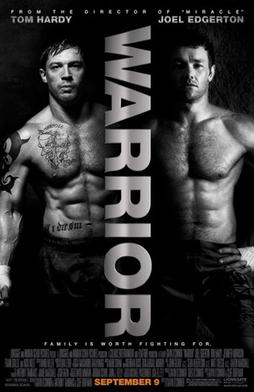 Warrior is a Drama about two brothers who enter a martial arts tournament. This film deals with the brothers struggling relationship with each other and their father.
 This poster is very different to the last, it is dark and looks almost mysterious. The colour scheme ranges from black to white to silver, and this could give the impression it is a serious, violent films nothing like the 'in your shoes' which is easy watching and sugar coated. The same colours are used through out the poster except for one word; the release date which is completely different in bright orange to attract more attention. The two men on the poster are half shaded in the dark almost asif they don't want to be fully seen or understood, this could also give the impression that they aren't who they seem to be or that they are hiding something about themself. Because they are both stood in the same position wearing only trousers could suggest that even though they are different people they do have some similarities. This idea could also be how it shows you they are brothers.
The two halfs of the poster could represent the rivalry between them, both their relationship with each other as well as their fighting match against each other. The name of the film through the centre is very powerful as it is big, bold, capitalised, and looks metalic helping it look tough and strong. Also the metalic silver colour it is written in could represent the medals won in the competitions.
 Because of the strong, masculin impression it gives to the audience, could help the film be aimed more toward men than women.
 Like the last poster the name of the main actors and director is stated at the top of the poster, again in the same silver colour as the title to show its importance. Instead of stating the directors name it only says the film they last directed, maybe because he isn't as well known as someone like Steven Speilberg and would like to think the last film he created was good enough for them to be recognised.